User Research
Research Strategy
The first thing we focused on was our research strategy. In order to identify the flaws in the current UX and UI, we conducted a usability test by interviewing people that fit our user archetype. These were users over the age of 50 who had lost a loved one within the past 5-10 years. Before we began our interviews we first needed to do two things.
First we conduct a competitor analysis. Aside from using and understanding Momento, this also gave us an insight in the market space and provided additional context for the problem we are working on. Secondly we create an interview guide in preparation for Usability Testing. This enabled us to conduct our interviews in a consistent and controlled manner.
Competitor Analysis
As part of our Competitor Analysis, we conducted an analysis on three apps with similar product offerings to Momento. These were: Thread.Care, Saga and A Lasting Tale.
We focused our research on User Interface elements and User Experience Flows – including the Sign Up process, Recording stage, User Ratings and the Features.

Competitors: Colour Scheme
Used by A Lasting Tale, Green is often seen in nature as trees or grass and it offers a sense of calm and tranquility. Used by Thread.Care, Blue is often seen in nature as the sky or the ocean but it is also a colour of trust, which is why it is popularly used by banks and healthcare providers.
It’s important that Apps like these convey a sense of calm and is emotionally welcoming, otherwise users might feel at unease and could quickly turn away from the experience.

Competitors: Sign up (Saga)
These are the different ways in which the different apps have approached their Sign Up process.
With Saga, the sign-up process involves mobile verification, name and eventually a profile picture. This is a traditional way of signing up a user.

Competitors: Sign up (Thread.Care)
Likewise Thread Care offers a very similar process, but this time with a progress indicator to show the user that they are completing tasks towards the final goal. As with Saga, they offer personalisation in the form of a profile picture.

Competitors: Recording Function
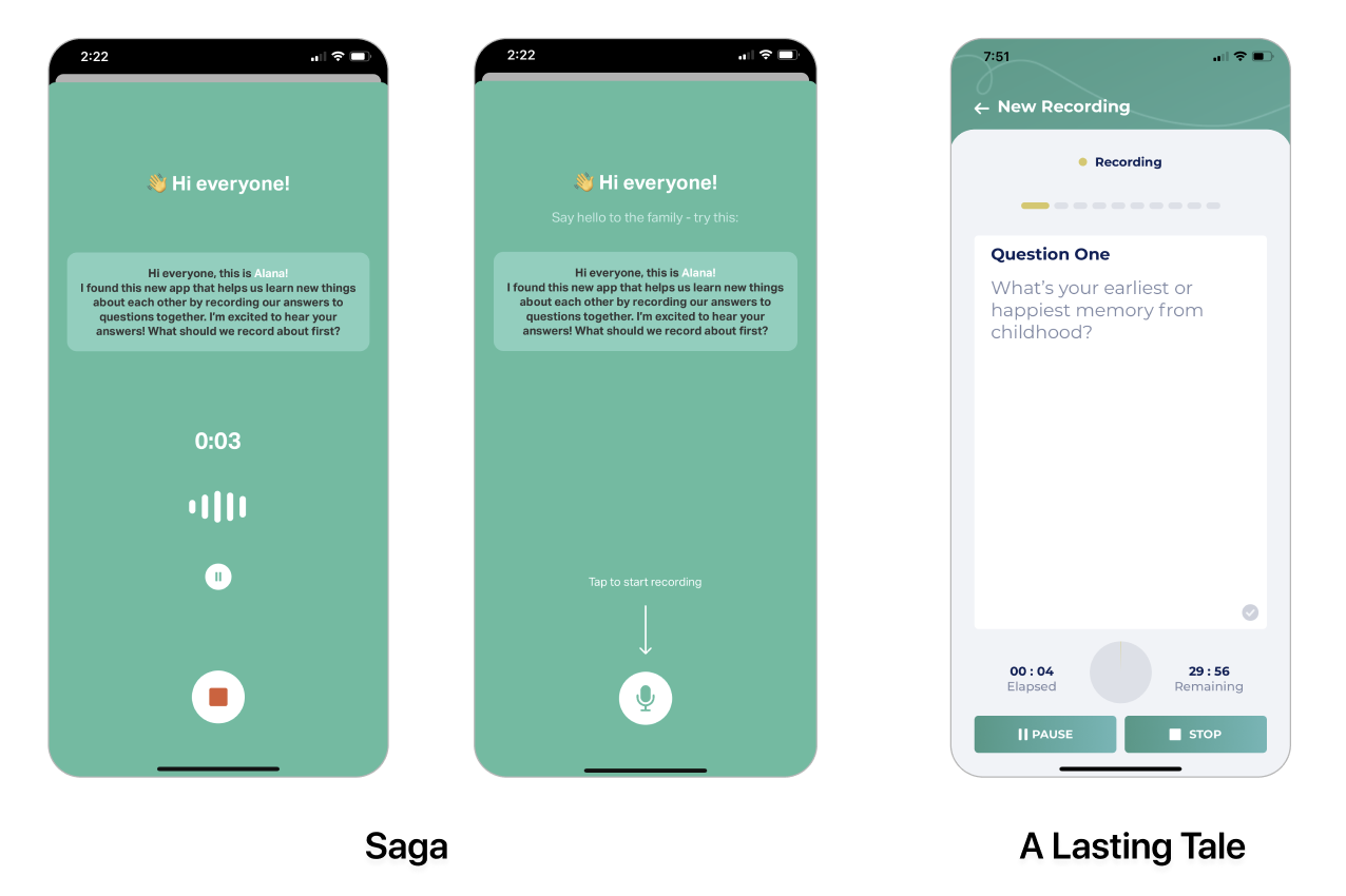
The recording function for A Lasting Tale indicates to the user where to start recording using an arrow and a microphone icon. Once the user has started recording, they’re able to pause and stop the record with clearly indicated ‘Pause’ and ‘Stop’ buttons.

Competitors: App Features
Both Thread Care and A Lasting Tale have good ratings but they don't have the volume of reviews to back up that credibility. A consistent theme for all three apps is the demand for users who live overseas.
The distance between relatives can be made easier when using these apps to record conversations.

Interview Guide
We created an interview guide that allowed us to follow a structured interviewing process, ensuring that each team member records their interview in a consistent manner. With this guide we conducted 5 user interviews, recording video with the online tool Lookback.io and then scribing our findings on a Miro board.

Research Objectives
The intent of the UX usability testing activity is to identify any usability issues including:
- Assess whether the terminology is understood by users and appropriate language is used
- Determine whether the process flows in a logical way
- Assess if users can effectively navigate through the process using the UI elements
- Assess whether the content adequately supports users
- Analysis of how the design measures up against user goals, business goals, project intent, and system or technical constraints
Research Participants Demographic
For our usability testing we interviewed 5 different people: Glenda, Heather, Denise, Paul and Anahid.
The uses were located in Australia in the UK. There was a range of technical abilities.
![]()
Research Synthesis
After our interview we grouped and categorised the data into an Affinity Map which enabled us to have a clearer understanding of the user experience.
![]()
Consequently this allowed us to create an Empathy Map which enables us to step into the shoes of the user.

Usability Testing Insights
![]()
Onboarding Section
- The intro text made sense. It was clear and simple to read.
- However, throughout the app, users felt there was too much text to read. This meant that some information was not being read which lead to confusion.
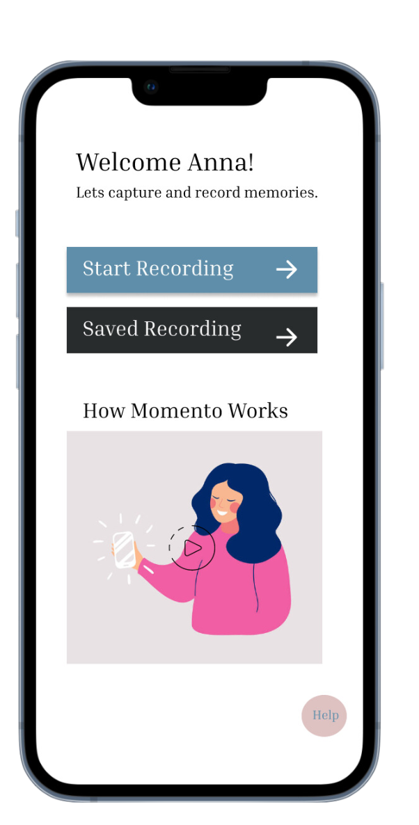
- Users felt the design was too formal and the intial impression was not welcoming.
What we propose :
- The intro sections need to be more concise by shortening the amount of text.
- The experience needs to be more visually engaging so users feel excited about what they're going to take part in.
Questions Section
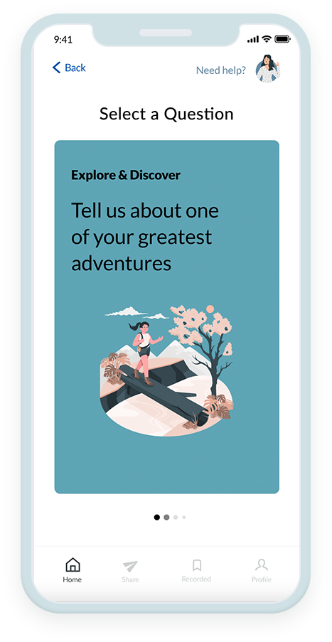
- The images in the questions relating to “Childhood” emotionally connected with mutiple users.
- The visual design of the app should use imagery and text that reflects the emotional sentimentality of recording memories during the onboarding process
What we propose :
- We will sketch some ideas on how we can improve the intro page and the end of session page focusing on enhancing the users experience.
- We will focus on color, images that will nature the users and pul them in a calm and receptive head space.
- The recording process wasn't clear both, before, during and after the recording.
- Users were not aware that the app was recording all the time – and assumed that they had to click a button to start a recording
- Some users thought the red light was something you click to either start recording or end the session.

What we propose :
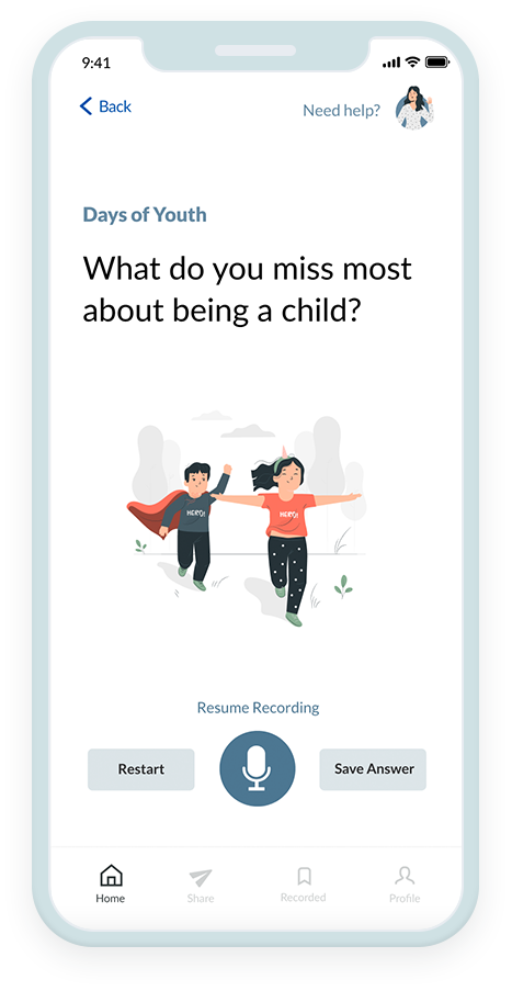
- Competitors have the ability to start, pause, save and edit recordings.
- We recommended that MM have the same functionality available.
Completing Session
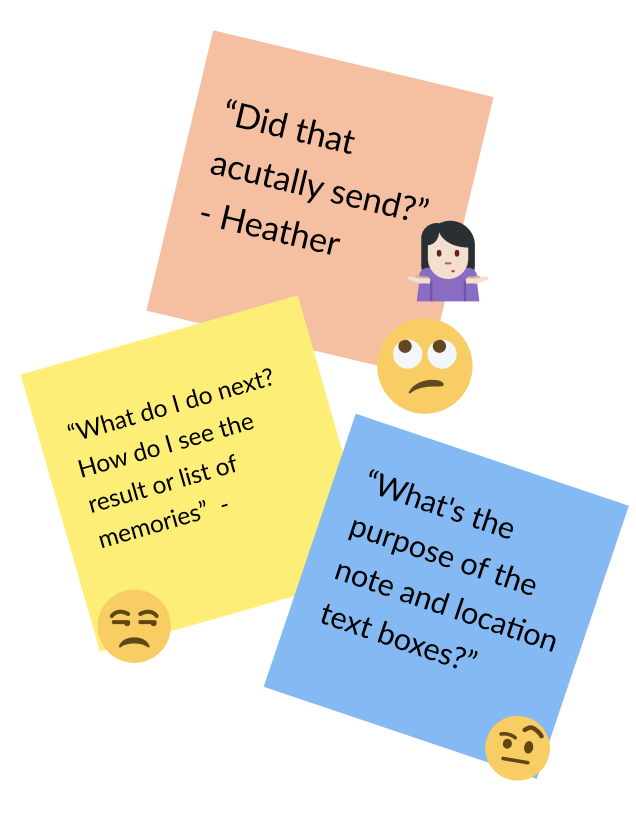
- Users were unclear on what happened to their recording.
- They were unsure if:
- The recording was sent
- What the next step should be
- How the “memory bank” worked
- This was a ‘Huh’ moment in the process flow – it left users feeling confused and unsure of what to do next
What we propose :
- We will focus on adding additional steps to the user flow to allow users to return and carry out more sessions and to find out more about Momento.
- We believe through the results of our testing – that the users want to interact with the app by being able to listen, edit and record each question and add visual imagery and videos.
- This will ensure users are telling “their true” story.
User Flow
After numerous testing and feedback we altered the user flow of the app, so it would be a better experience for all users. Due to the short time frame for the project, we decided to focus our efforts on improving the recording process.

How Might We
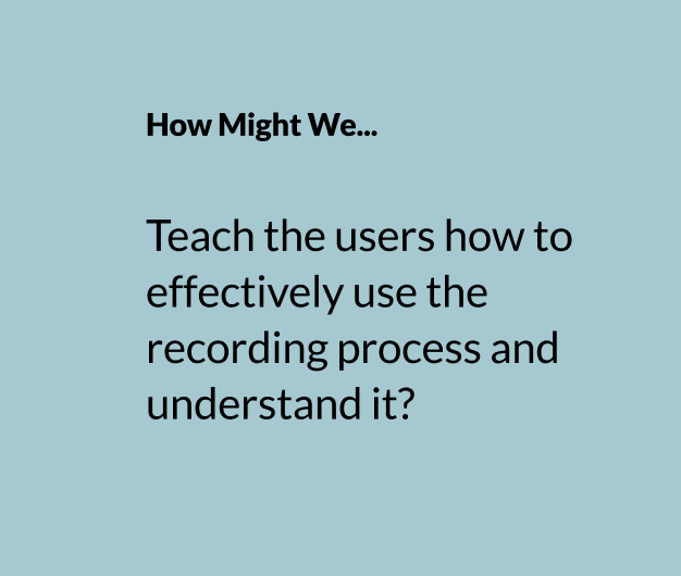
We conducted a brainstorming session where we re-framed the problem.
We started thinking about the recording process, and spent time sparking ideas for possible innovative solutions as a collective team.
Sketch
The next steps were to each do a lo-fi sketch using the new user-flow we created.
Here quickly incorporated our brainstorming ideas into rough sketches, and outlined the different screens from A-B.

Lo-Fi Wireframing
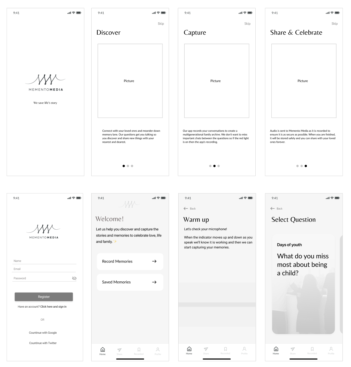
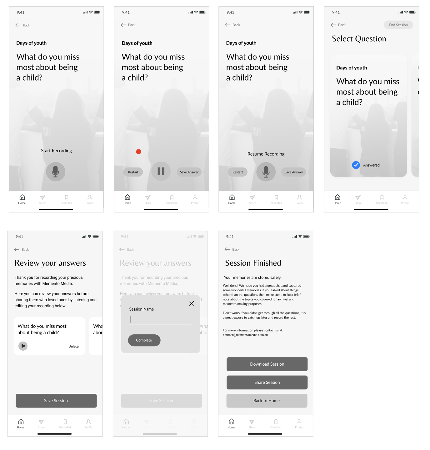
After sketching out our wireframes, we moved into Figma and created lo-fidelity wireframes.
Following the user journey map, we chose a single ‘happy journey’ and mapped out the different designs.


Design System
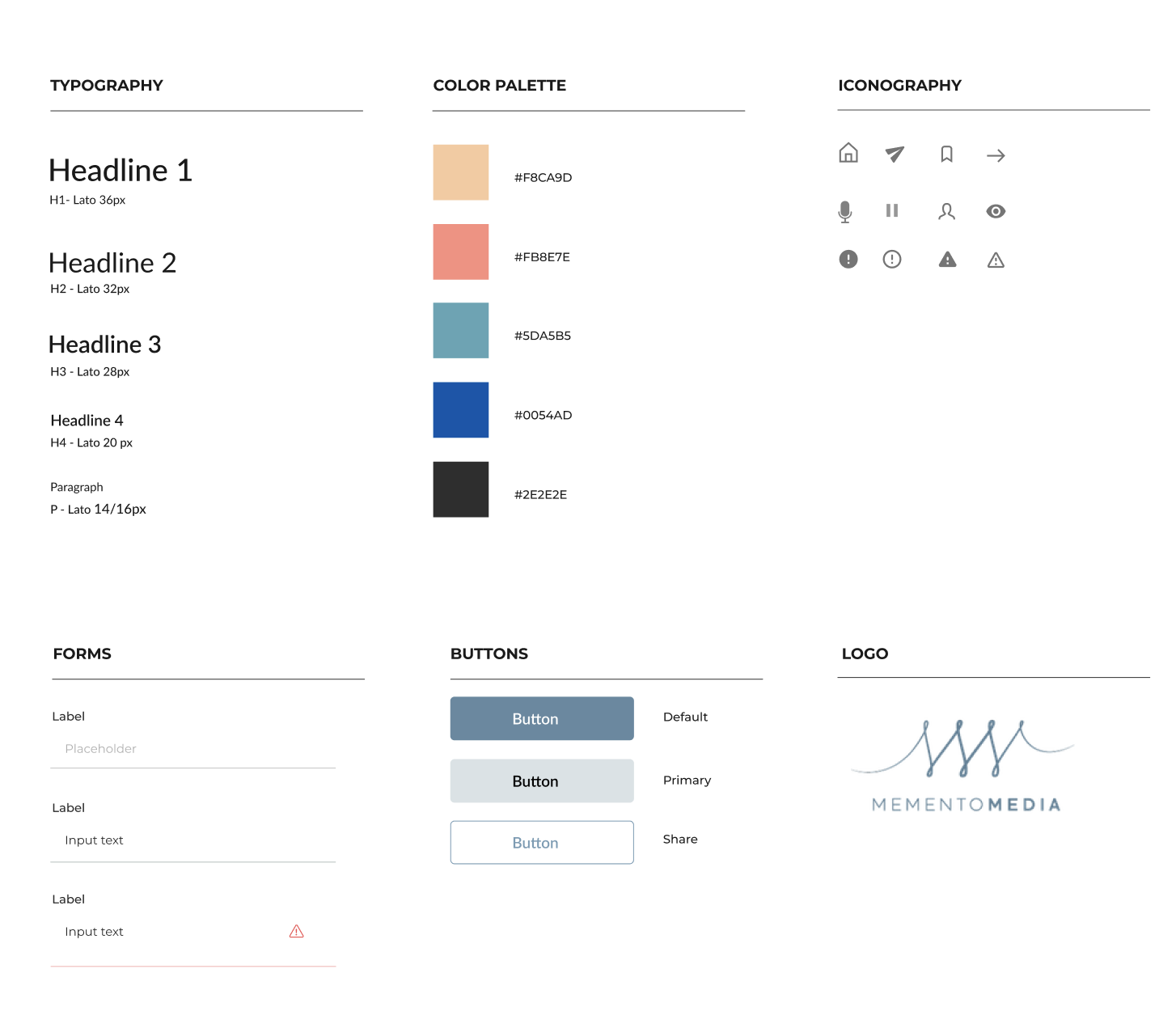
We came up with a design system to add consistency, structure and communication across all team members. We chose simple readable humanist typeface that would improve reading legibility at both small and large sizes. The colour palette is mature yet modern and has good contrast.
We also implemented icons and friendly illustrations to bring some fun and enjoyment to the app.

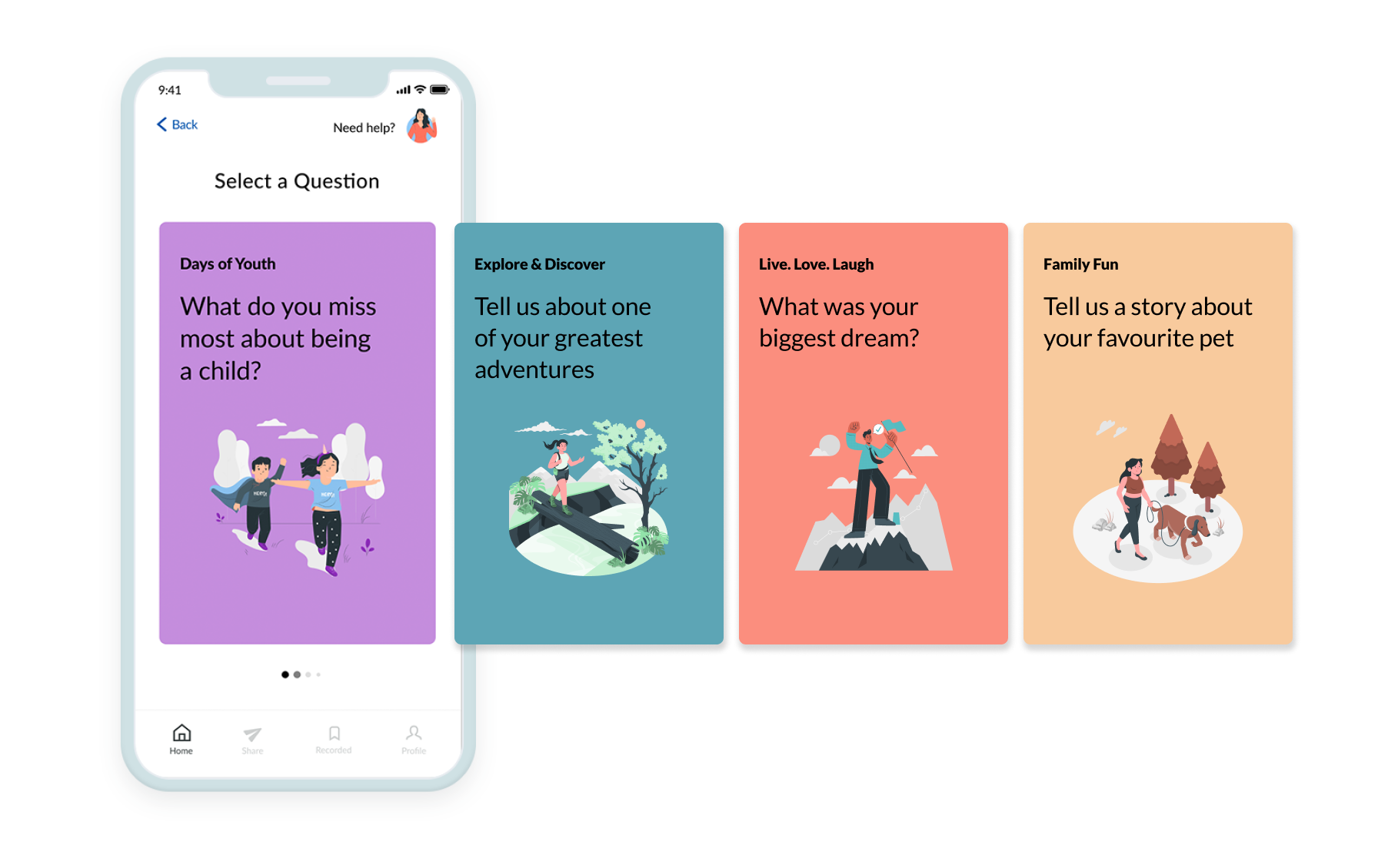
The Prototype
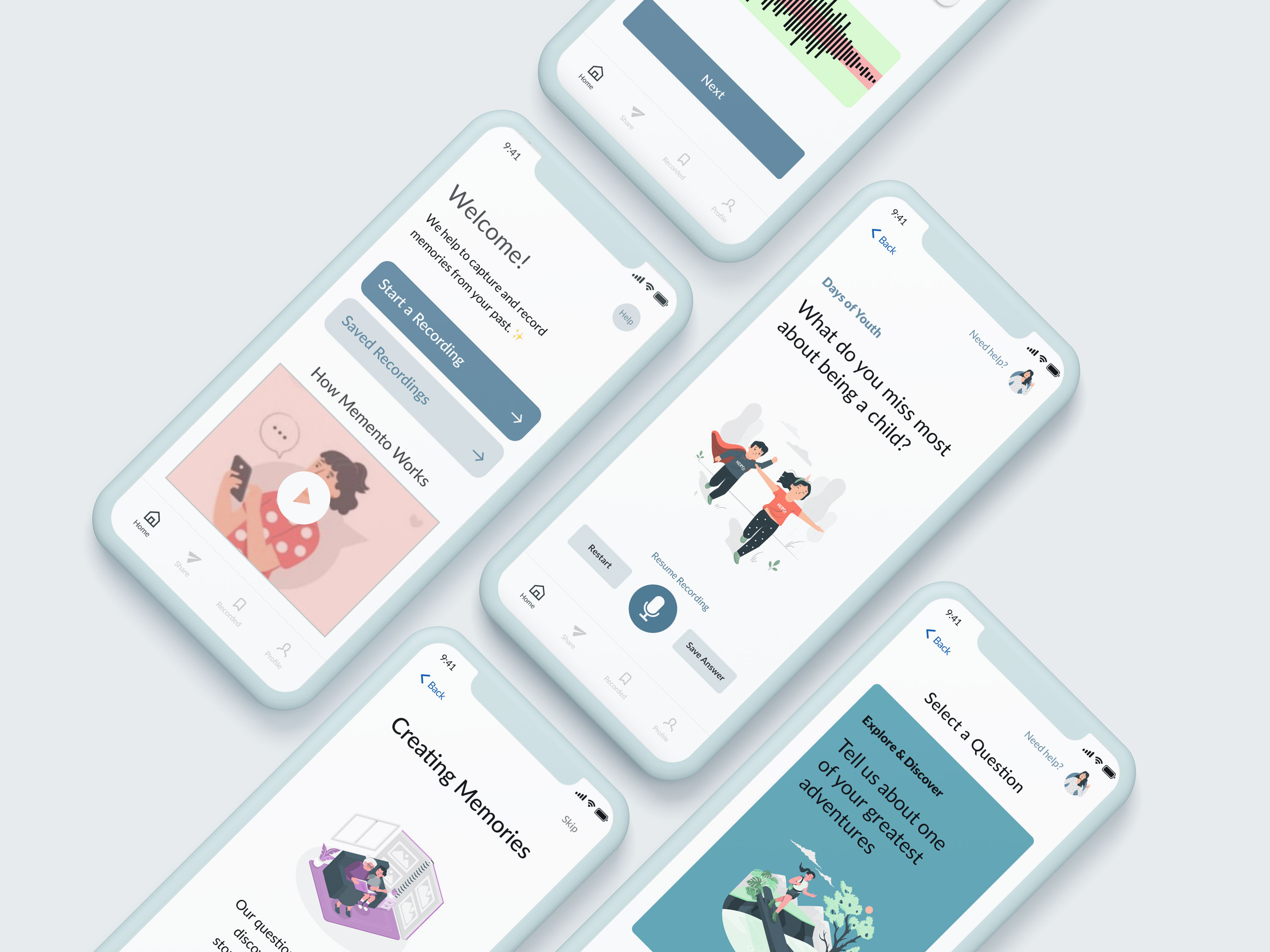
We have combined all the elements shown throughout the design process to create what we feel is a warm, functional, fun and approachable app.
