Sketches, Wireframes and Prototypes
I typically prefer sketching interface and interaction designs as it allows for greater exploration and generation of more ideas without being concerned with smaller details such as colors, fonts, and precise alignment.
I have also found that sketching also improves communication when early designs are being shared with the team. It has everyone focus on the important issues at this early stage, such as the overall structure and flow of the interaction, while not being distracted by the details of the look.

User Testing
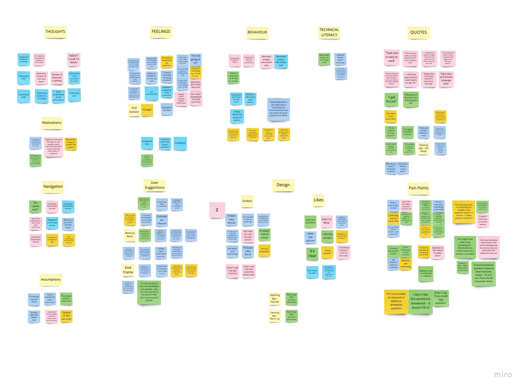
Following the creation of the interactive prototypes in Axure it was time to test the design. I created a test plan and coordinated with Call Center staff to conduct the test on location at the Resource Center. I then conducted moderated usability tests with customer service representatives (CSRs), recording our sessions which were referenced during analysis. Findings from the test were shared and discussed with the team. Adjustments were made to the wireframes to ensure that all members of the team were clear on modifications to the original design.
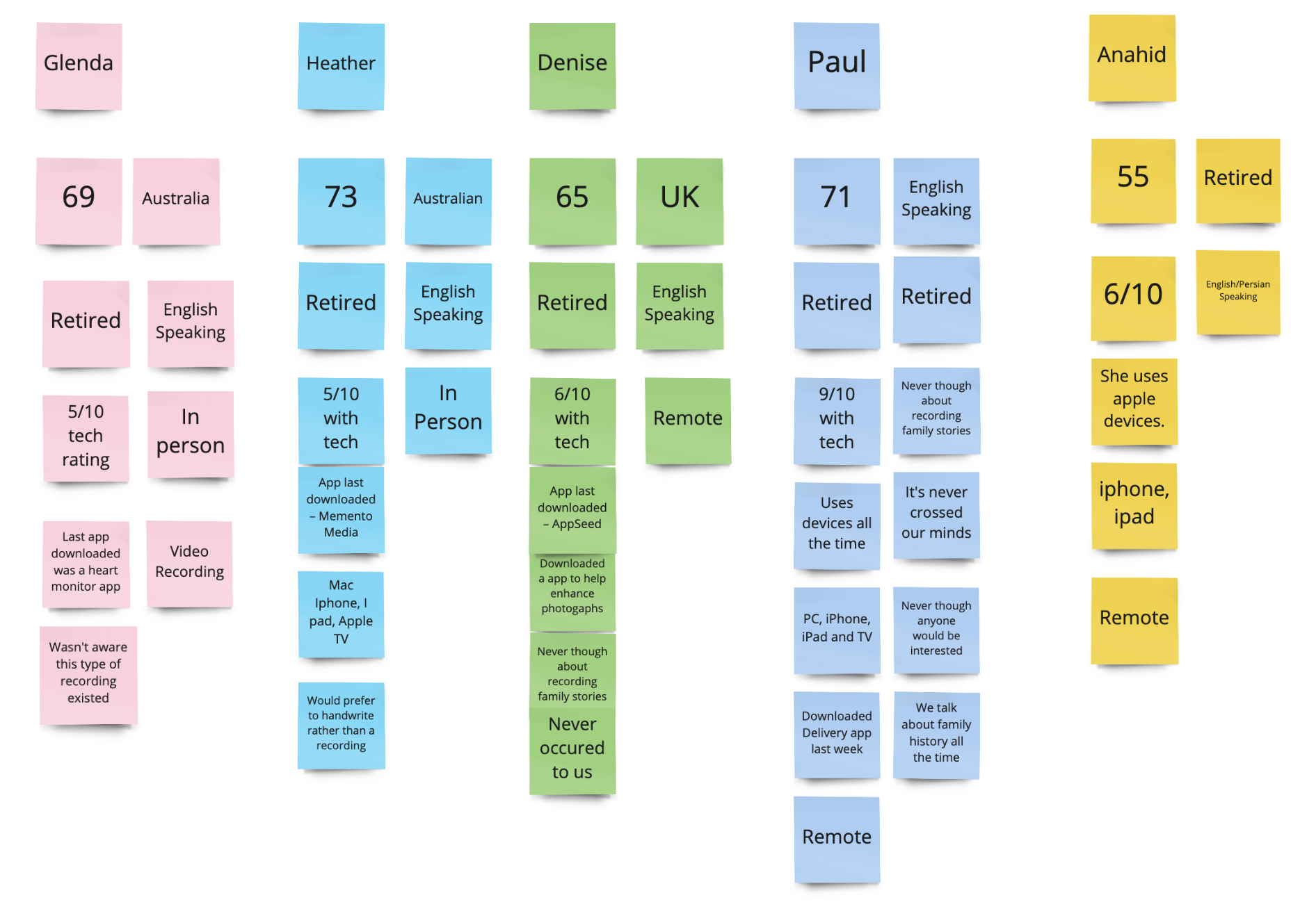
The uses were located in Australia in the UK. There was a range of technical abilities.

High-Fidelity Mockups and Interactions
With input from the testing sessions I moved to create high-fidelity mockups using Adobe Photoshop and InVision. This effort included creating visual mockups of the final design for both tablet and desktop displays (our targeted delivery platforms).
Interactions and application flow were also included in the InVision prototypes which were shared and reviewed for final input from both the client and the development team. This approach not only guided the development team, it significantly reduced the potential for “surprises” and personal interpretations of how the application should be presented and behave.

Design System & Style Guide

With the final interface design completed, an inventory of all interface elements and components were identified and documented in a style guide to be used as a front-end development reference.
The decision to document the visual interface was also guided by the fact that additional applications and marketing materials were on the ASERT roadmap. Using consistent styles and interactions not only reduced development team effort, but also introduced consistency of the experience across all ASERT digital properties (public websites, email communication, presentation materials, etc.)

Results and Outcomes

By using user-centered design methodologies, the team was able to deliver a functional application that exceeded the project's objectives. It also served as a platform for additional products and services for ASERT in their effort to serve the autism community throughout Pennsylvania.
